If you add animations to slideshows, they should serve some semantic or rhetorical purpose. Animations should reduce cognitive load, not increase it by being a distraction.
When should you add animations?
I like adding animations to my presentations when they serve a purpose, but they need to be use intentionally. Animations can easily become a distraction when are there are too many of them or when they are too extreme. On the other extreme, sudden jumps between slides and figures can in some scenarios make it difficult to follow what is going on.
Before I go further, I will note that there are different rhetorical situations in which a slide show crops up. If you are making slides for a class or that might need to be reviewed later, I would lean towards more text-heavy slides that can be understood by looking at them without the need for a presenter. Slides for a conference presentation, on the other hand, are not a product in and of themselves. When you are speaking at a conference, the product is the paper you are presenting on, and maybe a recording of you talking. This means that, at a conference, the focus should be on you, the presenter! You want people listening to you and you don’t want them distracted and trying to catch up on what is on your slides.
I still advocate for simpler slides in class. No one likes being in a class where the professor just mindlessly reads endless bullet points off of their slides. It is appropriate for class slides to lean more heavily towards text and equations than presentation slides though.
Some good rules of thumb for presentation slide design that I’ve picked up over the years are:
- Do not clutter your slide with text. People cannot read a slide and listen to you talk at the same time. If there is text on my slide, I try to say it at the same time that it appears. So typically my slides are just there to accentuate the point I am trying to make.
- Avoid bullet points; avoid more than three or four on a slide. Bullet points are an extremely efficient way to pack text onto a slide. So, as a corollary to point #1, you should avoid bullets when you can. My “bullet points” don’t even look like bullets: just some centered text in large font.
- Introduce detail gradually. There are some studies or whatnot that suggest we can’t hold more than 7±2 things in our head at one time, but you don’t need a serious study to recognize that starting with a simple diagram with, say, 3 boxes and then gradually adding in other components step-by-step. When bullets are necessary, reveal them one at a time.
Some rules I have for animations:
- Animations need to be snappy. I make most of my animations last 0.5–0.8 seconds; any longer feels like a drag. You don’t want to keep people waiting for your animation to finish.
- Motion draws the eye; use it to accentuate what you want people looking at. I will animate boxes drawing around a piece of source code that I want to talk about, and then animate moving that box when I want to draw their attention else where. I animate arrows going from source to destination both to focus attention on the salient point of connecting two concepts, as well as to underscore what an arrow denotes.
- Every motion serves a purpose. Never wiggle or morph things just because it’s pretty. If you use a transition like Magic Move (Keynote) or Morph (Powerpoint) and keep something between slides, it must be deliberate and denote the same thing—using such a transition just make the words that happen to be the same completely swap places is distracting and confusing.
Animations that I use
In this section I will list a few animation patterns I use in my presentations. Spoiler: I make heavy use of the the Magic Move slide transition. There are two disjoint categories of animation:
- Slide transitions
- These are animations that fire between slides. Magic Move is one of these.
- Object animations
- These apply to things on the slide—such as text, images, shapes, etc.—rather than the slide itself. These come in three subtypes: build in, build out, and action. Build in and out describe how objects appear/disappear from slides, and actions do things like move and scale the object.
I use these transitions only where they make sense. If I have a thematic break, then I will not add any animations. Default to no animation; opt-in only where it makes sense.
Magic Move for diagrams
This is the big one. Magic Move looks at objects that are on the start slide that are also on the next slide, and animates moving/scaling/etc. the common shapes from their places on the start slide to where the end up on the end slide while fading in/out the objects that are not the same.
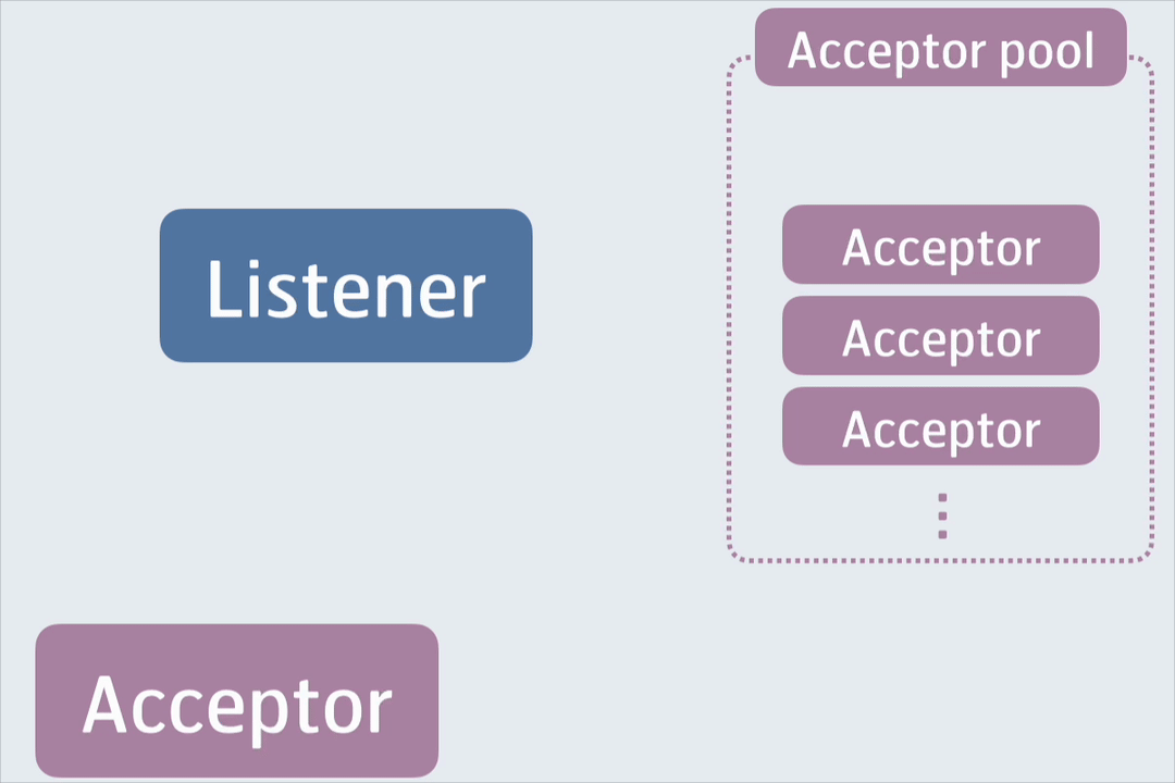
I use this transition to build in and animate diagrams:
I also use this for bullet points:

Pop for subtle emphasis
When I make something appear or disappear on a slide, I want it to draw a little bit of attention to itself because I will be talking about that thing when that happens. A little bit of motion draws the eye of the audience and just makes the presentation feel a little more springy.

Just as a side note, I found a really great way to use Typst for code blocks in papers and presentations. I did a small write-up here on my blog a few months back. Using this significantly improved my workflow for putting code on slides.
Line draw for arrows and boxes
This one is great and in Keynote it applies only to arrows and boxes: it draws an arrow from start to finish as you would if you were doing this with chalk or marker on a whiteboard.
I particularly like this one because it mimics what doing this by hand would look like.
![]()
Use animations wisely
There is a whole lot that goes into giving a good talk, and how your slides look is not more important than what you talk about, how you structure your talk, and how you engage with the audience. That said, I think the slides academics use need a little more delight and tasteful design. Too many talks have slides filled with text that the audience can only read at the expense of ignoring the speaker, or overwhelm the audience with massive diagrams that are difficult to follow in the 5–30 seconds the slide is visible.
Use your slides as a rhetorical tool: use them to accentuate and illustrate your point while the audience listens to you. Use animations where it makes sense to keep the audience’s focus where your talking points land. Always make sure it illuminates and never distracts.