What I Like in a Font for Code
5 Dec 2022
I’m well aware that I may have a bit of an obsession with fonts. I don’t think that’s too unusual for someone who works in tech, however. Sites like Programming Fonts exist to let people test drive and compare a bunch of different fonts. Just for fun, I thought I’d write up some of the features I look for in a programming font that I’ve come to deliberately pick out.
Critical letter forms: i, I, l, 1; o, O, 0
#
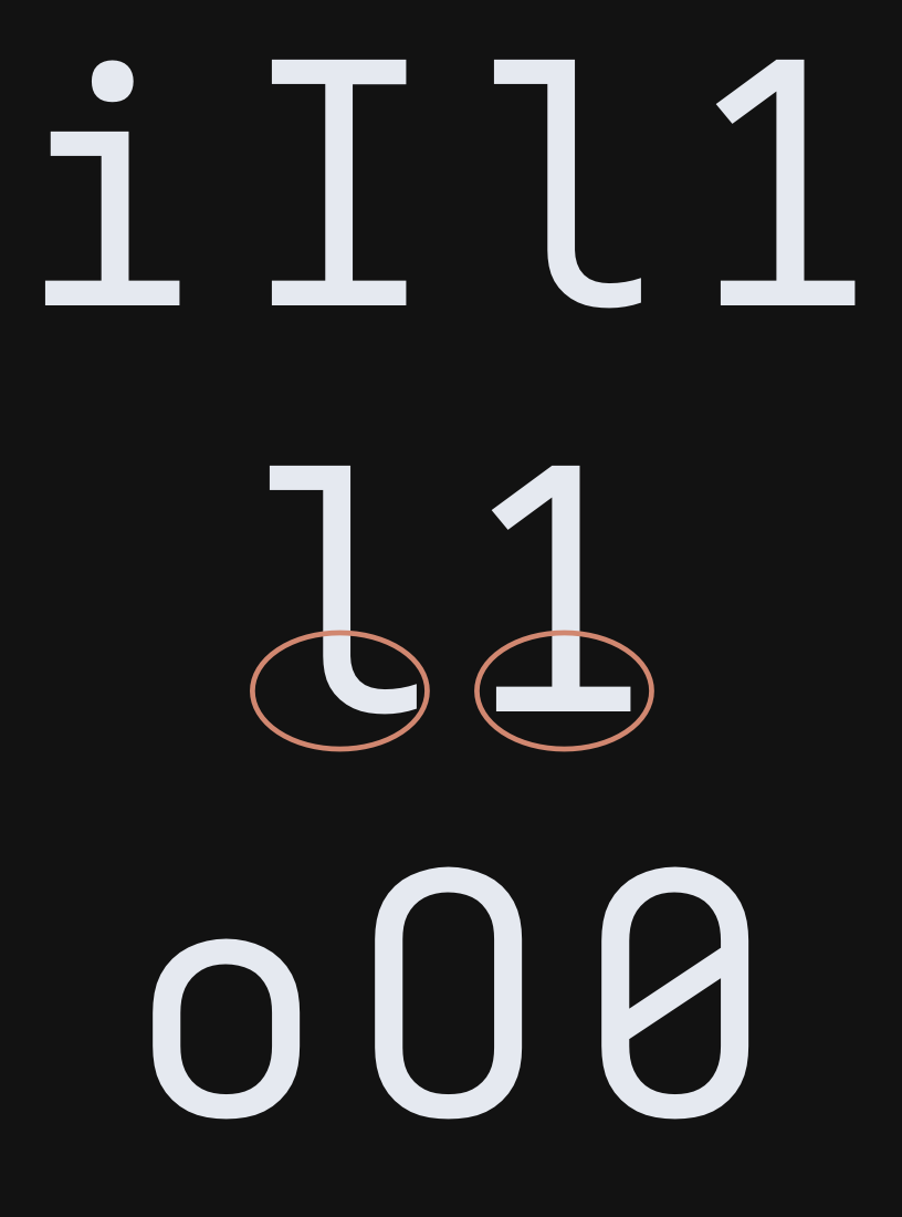
These are probably the most important letters to get write in any font that’s meant to be hyper-legible: lowercase l must be easily distinguishable from an uppercase I or the number 1, and the lowercase i should stand out nicely as well.
I like to foot of the lowercase l to be curved to more easily distinguish it from the number 1. For example, this is what the letters look like in my Iosevka Output build:

I find that that helps readability. I go back and forth as to whether or not I like the foot of the lowercase i to be likewise curved. My current font doesn’t have that set, but I used to configure Input Mono to work like that.
Zeros must be distinct from capital O. That’s usually pretty easy for a coding font to get right. I personally like the slash—I think that’s what I grew up with. Nothing wrong with a dot though.
Increased pickiness: a, g
#
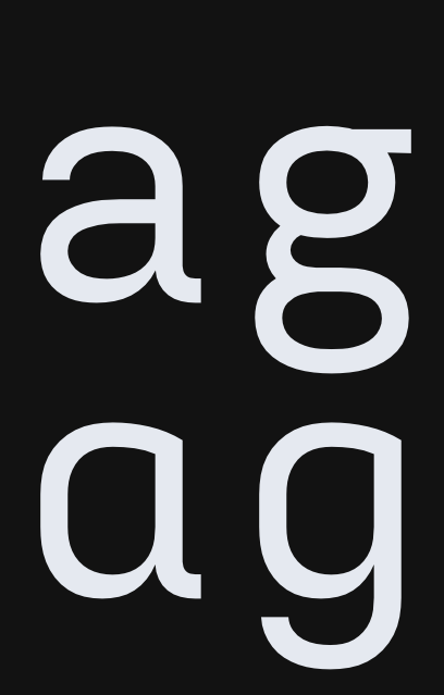
I like double-storey a and g rather than their simpler counterparts. A single-storey a looks a little too much like a lowercase o, and I find the g without two loops looks too much like a lowercase y.

Width #
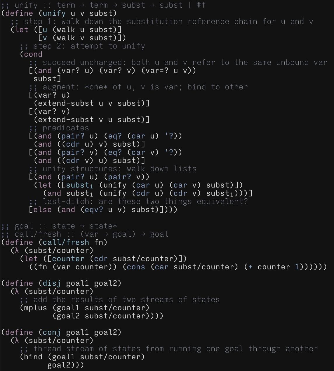
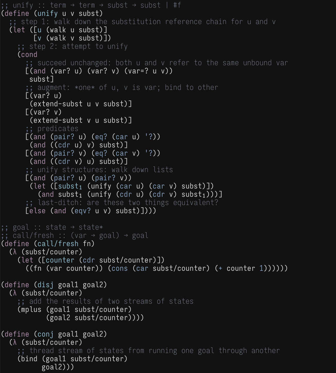
Narrow fonts appeal to a lot of people. I don’t get it, however. I like how gentle an extended font is on the eyes. One of the reasons why I liked Input Mono so much was because it had nice, comfy, wide characters. Compare the readability:
{{< tabs “normal-and-narrow” >}}
{{<tab “Normal”>}}

{{</tab>}}
{{<tab “Narrow”>}}

{{</tab>}}
{{< /tabs >}}
I find the wider font to be much more readable.
Ligatures #
Nope. Just nope. I like to see exactly what characters are in my files. See Matthew Butterick’s take for more reasons why.